> For the complete documentation index, see [llms.txt](https://sangmandu.gitbook.io/til/llms.txt). Markdown versions of documentation pages are available by appending `.md` to page URLs; this page is available as [Markdown](https://sangmandu.gitbook.io/til/til_ml/boostcamp-2st/s-data-viz/3-2-color.md).
# (3-2) Color 사용하기
## 1. Color에 대한 이해
### 1.1 색이 중요한 이유
색이 주는 느낌이 있기 때문이다. 파란색을 시원함, 빨간색은 뜨거움. 물론 모든 사람이 공통적으로 느끼지는 않는다.
### 1.2 화려함이 시각화의 전부는 아니다.

왼쪽 그래프는 화려하고 예쁘지만 독자에게 주고자 하는 인사이트가 무엇인지 알기 힘들다.
### 1.3 색이 가지는 의미
높은 온도에는 빨간색, 낮은 온도에는 파란색을 주로 사용한다. 카카오는 노란색, 네이버는 초록색을 사용한다. 이렇게 기존 정보와 느낌을 잘 활용하는 것이 중요하다.
어떤 색을 사용할지 결정하기가 어렵다면 조사를 통해 결정하라. 이미 사용하는 색에는 이유가 있다.
## 2. Color Palette의 종류
### 2.1 범주형
최대 10개까지 색을 사용하되, 너무 많이 사용하는 것은 지양하도록 한다. 이러한 색들은 색의 차이로 구분하는 것이 특징이며 채도나 명도를 개별적으로 조정하는 것도 지양해야 한다.

### 2.2 연속형
연속적인 색상을 사용하여 값을 표현한다. 어두운 배경에서는 밝은 색, 밝은 배경에서는 어두운 색이 큰 값을 표현한다. 색상은 단일 색조로 표현하는 것이 좋고 균일한 색상 변화가 중요하다.

### 2.3 발산형
연속형과 유사하지만 중앙을 기준으로 발산한다. 상반된 값을 나타낼 때 효과적이며 양 끝으로 갈 수록 색이 진해지는 특징이 있다.

## 3. 그 외 색 Tips
### 3.1 강조와 색상 대비
데이터에서 다름을 보이기 위해 하이라이팅을 할 수 있다. 강조를 위한 방법 중 하나가 색상 대비이다.
* 명도 대비 : 밝은 색과 어두운 색을 배치하면 밝은 색은 더 밝게, 어두운 색은 더 어둡게 보인다
* 색상 대비 : 가까운 색의 차이가 더 크게 보인다
* 채도 대비 : 채도의 차이. 채도가 더 높아보인다
* 보색 대비 : 정반대 색상을 사용하면 더 선명해 보인다
### 3.2 색각 이상
* 삼원색 중에 특정 색을 감지 못하면 색맹
* 부분적 인지 이상이 있다면 색약
## 3-2. Color
matplotlib에서 다양한 [color api](https://matplotlib.org/stable/api/colors_api.html)를 제공하고 있으니 참고하길 바랍니다.
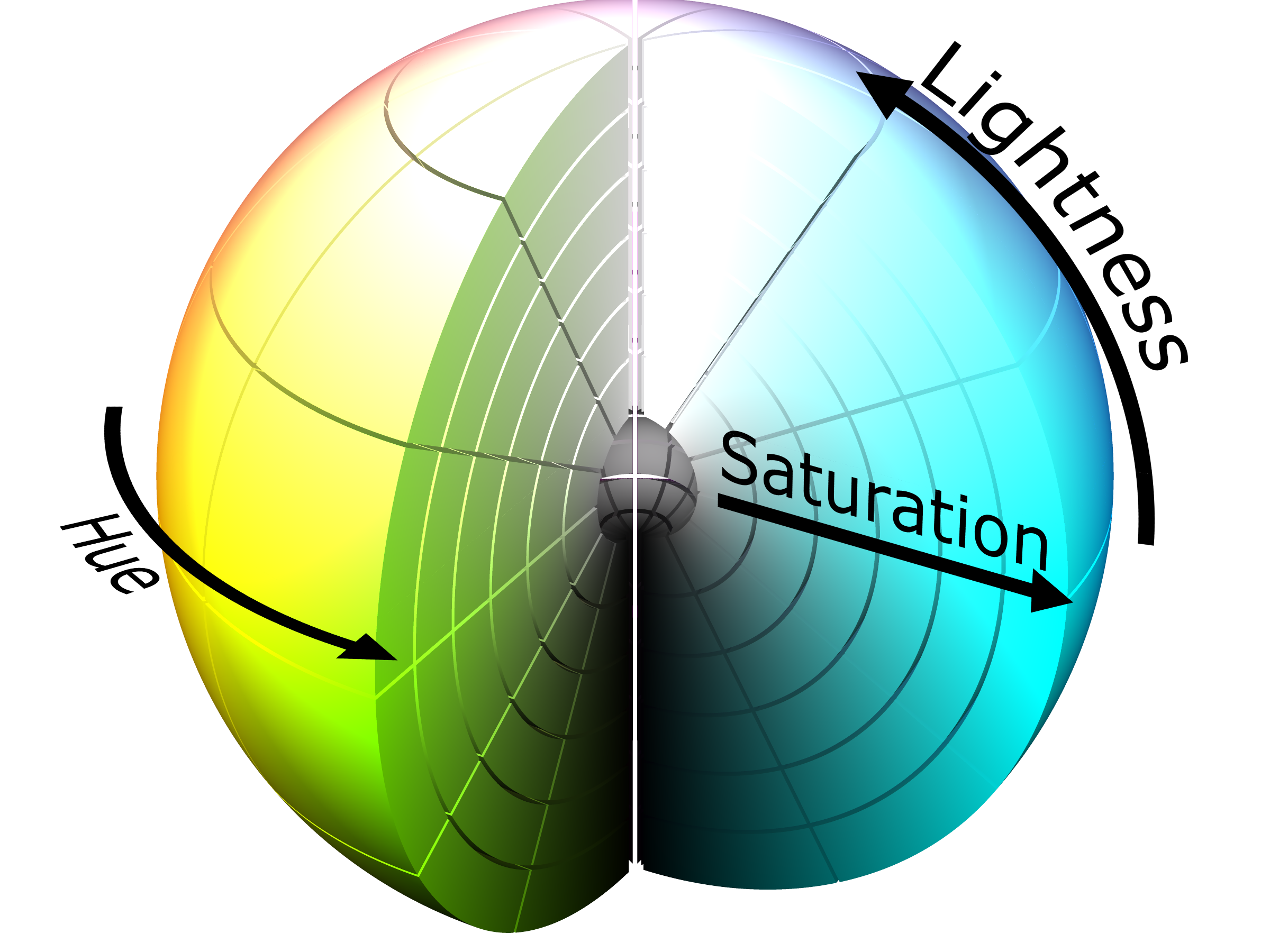
### 0. 색상 더 이해하기
색을 이해하기 위해서는 rgb보다 hsl을 이해하는 것이 중요합니다.
* **Hue(색조)** : 빨강, 파랑, 초록 등 색상으로 생각하는 부분
* 빨강에서 보라색까지 있는 스펙트럼에서 0-360으로 표현
* **Saturate(채도)** : 무채색과의 차이
* 선명도라고 볼 수 있음 (선명하다와 탁하다.)
* **Lightness(광도)** : 색상의 밝기
* [Github Topic Color-palette](https://github.com/topics/color-palette)
* [karthik/wesanderson](https://github.com/karthik/wesanderson)
* [Top R Color Palettes to Know for Great Data Visualization](https://www.datanovia.com/en/blog/top-r-color-palettes-to-know-for-great-data-visualization/)
등 다양한 색상을 살펴보며 아래의 분류들을 잘 활용하면 좋습니다.
그리고 추후에는 다음과 같은 도구로 색상을 선택할 수도 있습니다.
* [Adobe Color](https://color.adobe.com/create/color-wheel)
### 1. 범주형 색상 (Qualitative)
이미 앞서서 많이 사용했던 범주별 분류입니다.
Built-in Colormap을 사용하여 다양한 표현방법을 살펴보도록 하겠습니,
```
import numpy as np
import pandas as pd
import matplotlib as mpl
import matplotlib.pyplot as plt
```
```
student = pd.read_csv('./StudentsPerformance.csv')
student.head()
```
| | gender | race/ethnicity | parental level of education | lunch | test preparation course | math score | reading score | writing score |
| - | ------ | -------------- | --------------------------- | ------------ | ----------------------- | ---------- | ------------- | ------------- |
| 0 | female | group B | bachelor's degree | standard | none | 72 | 72 | 74 |
| 1 | female | group C | some college | standard | completed | 69 | 90 | 88 |
| 2 | female | group B | master's degree | standard | none | 90 | 95 | 93 |
| 3 | male | group A | associate's degree | free/reduced | none | 47 | 57 | 44 |
| 4 | male | group C | some college | standard | none | 76 | 78 | 75 |
#### 1-1. 색 살펴보기
matplotlib의 colormap을 다루는 것은 살짝 복잡합니다. 강의에서는 일부 테크닉을 소개합니다.
```
# Group to Number
groups = sorted(student['race/ethnicity'].unique())
gton = dict(zip(groups , range(5)))
# Group에 따라 색 1, 2, 3, 4, 5
student['color'] = student['race/ethnicity'].map(gton)
```
```
# color list to color map
print(plt.cm.get_cmap('tab10').colors)
```
```
((0.12156862745098039, 0.4666666666666667, 0.7058823529411765), (1.0, 0.4980392156862745, 0.054901960784313725), (0.17254901960784313, 0.6274509803921569, 0.17254901960784313), (0.8392156862745098, 0.15294117647058825, 0.1568627450980392), (0.5803921568627451, 0.403921568627451, 0.7411764705882353), (0.5490196078431373, 0.33725490196078434, 0.29411764705882354), (0.8901960784313725, 0.4666666666666667, 0.7607843137254902), (0.4980392156862745, 0.4980392156862745, 0.4980392156862745), (0.7372549019607844, 0.7411764705882353, 0.13333333333333333), (0.09019607843137255, 0.7450980392156863, 0.8117647058823529))
```
범주형 색상은 채도와 광도는 거의 일정하고, 색상의 변화만으로 차이를 주는 것이 특징입니다.
```python
from matplotlib.colors import ListedColormap
qualitative_cm_list = ['Pastel1', 'Pastel2', 'Accent', 'Dark2', 'Set1', 'Set2', 'Set3', 'tab10']
fig, axes = plt.subplots(2, 4, figsize=(20, 8))
axes = axes.flatten()
student_sub = student.sample(100)
for idx, cm in enumerate(qualitative_cm_list):
pcm = axes[idx].scatter(student_sub['math score'], student_sub['reading score'],
c=student_sub['color'], cmap=ListedColormap(plt.cm.get_cmap(cm).colors[:5])
)
cbar = fig.colorbar(pcm, ax=axes[idx], ticks=range(5))
cbar.ax.set_yticklabels(groups)
axes[idx].set_title(cm)
plt.show()
```

이산적인 색을 사용한 막대그래프와 라인그래프는 이미 앞서 살펴봤습니다. 추후 이산적인 색상은 seaborn에서 적용하며 살펴보겠습니다.
일반적으로 tab10과 Set2가 가장 많이 사용되고 더 많은 색은 위에서 언급한 R colormap을 사용하면 좋습니다.
### 2. 연속형 색상
* 막대 그래프에서는 잘 사용하지 않고 2차원 데이터에서 사용한다
* Heatmap, Contour Plot
* 지리지도 데이터, 계층형 데이터에도 적합
#### 2-1. 색 살펴보기
색조는 유지하되 색의 밝기를 조정하여 연속적인 표현을 나타냅니다.
```python
sequential_cm_list = ['Greys', 'Purples', 'Blues', 'Greens', 'Oranges', 'Reds',
'YlOrBr', 'YlOrRd', 'OrRd', 'PuRd', 'RdPu', 'BuPu',
'GnBu', 'PuBu', 'YlGnBu', 'PuBuGn', 'BuGn', 'YlGn']
fig, axes = plt.subplots(3, 6, figsize=(25, 10))
axes = axes.flatten()
student_sub = student.sample(100)
for idx, cm in enumerate(sequential_cm_list):
pcm = axes[idx].scatter(student['math score'], student['reading score'],
c=student['reading score'],
cmap=cm,
vmin=0, vmax=100
)
fig.colorbar(pcm, ax=axes[idx])
axes[idx].set_title(cm)
plt.show()
```

#### 2-2. imshow
이미지 정보를 2d-array로 받아서 색상을 표현한다.
```python
im = np.arange(100).reshape(10, 10)
fig, ax = plt.subplots(figsize=(10, 10))
ax.imshow(im)
plt.show()
```

이를 활용하면 깃헙 잔디밭도 만들 수 있습니다.
```python
im = np.random.randint(10, size=(7, 52))
fig, ax = plt.subplots(figsize=(20, 5))
ax.imshow(im, cmap='Greens')
ax.set_yticks(np.arange(7)+0.5, minor=True)
ax.set_xticks(np.arange(52)+0.5, minor=True)
ax.grid(which='minor', color="w", linestyle='-', linewidth=3)
plt.show()
```

### 3. 발산형 색상
* 어디를 중심으로 삼을 것인가
* 상관관계 등
* Geospatial
#### 3-1. 색 살펴보기
```python
from matplotlib.colors import TwoSlopeNorm
diverging_cm_list = ['PiYG', 'PRGn', 'BrBG', 'PuOr', 'RdGy', 'RdBu',
'RdYlBu', 'RdYlGn', 'Spectral', 'coolwarm', 'bwr', 'seismic']
fig, axes = plt.subplots(3, 4, figsize=(20, 15))
axes = axes.flatten()
offset = TwoSlopeNorm(vmin=0, vcenter=student['reading score'].mean(), vmax=100)
student_sub = student.sample(100)
for idx, cm in enumerate(diverging_cm_list):
pcm = axes[idx].scatter(student['math score'], student['reading score'],
c=offset(student['math score']),
cmap=cm,
)
cbar = fig.colorbar(pcm, ax=axes[idx],
ticks=[0, 0.5, 1],
orientation='horizontal'
)
cbar.ax.set_xticklabels([0, student['math score'].mean(), 100])
axes[idx].set_title(cm)
plt.show()
```

### 4. 색상 대비 더 이해하기
#### 4-0. 특정 부분 강조를 위한 시각화
```python
fig = plt.figure(figsize=(18, 15))
groups = student['race/ethnicity'].value_counts().sort_index()
ax_bar = fig.add_subplot(2, 1, 1)
ax_bar.bar(groups.index, groups, width=0.5)
ax_s1 = fig.add_subplot(2, 3, 4)
ax_s2 = fig.add_subplot(2, 3, 5)
ax_s3 = fig.add_subplot(2, 3, 6)
ax_s1.scatter(student['math score'], student['reading score'])
ax_s2.scatter(student['math score'], student['writing score'])
ax_s3.scatter(student['writing score'], student['reading score'])
for ax in [ax_s1, ax_s2, ax_s3]:
ax.set_xlim(-2, 105)
ax.set_ylim(-2, 105)
plt.show()
```

#### 4-1. 명도 대비
```python
a_color, nota_color = 'black', 'lightgray'
colors = student['race/ethnicity'].apply(lambda x : a_color if x =='group A' else nota_color)
color_bars = [a_color] + [nota_color]*4
fig = plt.figure(figsize=(18, 15))
groups = student['race/ethnicity'].value_counts().sort_index()
ax_bar = fig.add_subplot(2, 1, 1)
ax_bar.bar(groups.index, groups, color=color_bars, width=0.5)
ax_s1 = fig.add_subplot(2, 3, 4)
ax_s2 = fig.add_subplot(2, 3, 5)
ax_s3 = fig.add_subplot(2, 3, 6)
ax_s1.scatter(student['math score'], student['reading score'], color=colors, alpha=0.5)
ax_s2.scatter(student['math score'], student['writing score'], color=colors, alpha=0.5)
ax_s3.scatter(student['writing score'], student['reading score'], color=colors, alpha=0.5)
for ax in [ax_s1, ax_s2, ax_s3]:
ax.set_xlim(-2, 105)
ax.set_ylim(-2, 105)
plt.show()
```

#### 4-2. 채도 대비
```python
a_color, nota_color = 'orange', 'lightgray'
colors = student['race/ethnicity'].apply(lambda x : a_color if x =='group A' else nota_color)
color_bars = [a_color] + [nota_color]*4
fig = plt.figure(figsize=(18, 15))
groups = student['race/ethnicity'].value_counts().sort_index()
ax_bar = fig.add_subplot(2, 1, 1)
ax_bar.bar(groups.index, groups, color=color_bars, width=0.5)
ax_s1 = fig.add_subplot(2, 3, 4)
ax_s2 = fig.add_subplot(2, 3, 5)
ax_s3 = fig.add_subplot(2, 3, 6)
ax_s1.scatter(student['math score'], student['reading score'], color=colors, alpha=0.3)
ax_s2.scatter(student['math score'], student['writing score'], color=colors, alpha=0.3)
ax_s3.scatter(student['writing score'], student['reading score'], color=colors, alpha=0.3)
for ax in [ax_s1, ax_s2, ax_s3]:
ax.set_xlim(-2, 105)
ax.set_ylim(-2, 105)
plt.show()
```

#### 4-3. 보색 대비
```python
a_color, nota_color = 'tomato', 'lightgreen'
colors = student['race/ethnicity'].apply(lambda x : a_color if x =='group A' else nota_color)
color_bars = [a_color] + [nota_color]*4
fig = plt.figure(figsize=(18, 15))
groups = student['race/ethnicity'].value_counts().sort_index()
ax_bar = fig.add_subplot(2, 1, 1)
ax_bar.bar(groups.index, groups, color=color_bars, width=0.5)
ax_s1 = fig.add_subplot(2, 3, 4)
ax_s2 = fig.add_subplot(2, 3, 5)
ax_s3 = fig.add_subplot(2, 3, 6)
ax_s1.scatter(student['math score'], student['reading score'], color=colors, alpha=0.3)
ax_s2.scatter(student['math score'], student['writing score'], color=colors, alpha=0.3)
ax_s3.scatter(student['writing score'], student['reading score'], color=colors, alpha=0.3)
for ax in [ax_s1, ax_s2, ax_s3]:
ax.set_xlim(-2, 105)
ax.set_ylim(-2, 105)
plt.show()
```
