# (3-1) Text 사용하기
## Matplotlib에서 Text
### Text in Viz
텍스트는 생각보다 Visual representation이 줄 수 없는 많은 설명을 추가해줄 수 있다. 또, 잘못된 전달에서 생기는 오해를 방지할 수 있으며 가장 쉽게 이해할 수 있다.
하지만 Text를 과하게 사용한다면 오히려 이해를 방해할 수도 있다.

## 3-1. Text
### 1. Text API in Matplotlib
기본적인 요소를 다시 한 번 살펴보겠습니다.
| pyplot API | Objecte-oriented API | description |
| ----------- | -------------------- | -------------------------- |
| `suptitle` | `suptitle` | title of figure |
| `title` | `set_title` | title of subplot `ax` |
| `xlabel` | `set_xlabel` | x-axis label |
| `ylabel` | `set_ylabel` | y-axis label |
| `figtext` | `text` | figure text |
| `text` | `text` | Axes taext |
| `annoatate` | `annotate` | Axes annotation with arrow |
```python
import numpy as np
import pandas as pd
import matplotlib as mpl
import matplotlib.pyplot as plt
```
```python
fig, ax = plt.subplots()
fig.suptitle('Figure Title')
ax.plot([1, 3, 2], label='legend')
ax.legend()
ax.set_title('Ax Title')
ax.set_xlabel('X Label')
ax.set_ylabel('Y Label')
ax.text(x=1,y=2, s='Text')
fig.text(0.5, 0.6, s='Figure Text')
plt.show()
```

`sub.title` 로 전체 fig의 타이틀을 설정해 줄 수 있으며 `ax.set_title` 로 각각의 그래프에 대한 타이틀을 지정해 줄 수 있다.
또, `ax.set_xlabel` 이나 `ax.set_ylabel` 로 x축과 y축의 타이틀을 설정할 수 있으며 좌표를 사용하는 `ax.text` 나 비율을 사용하는 `fig.text` 를 이용하여 작성할 수도 있다
### 2. Text Properties
#### 2-1. Font Components
가장 쉽게 바꿀 수 있는 요소로는 다음 요소가 있습니다.
* `family`
* `size` or `fontsize`
* `style` or `fontstyle`
* `weight` or `fontweight`
글씨체에 따른 가독성 관련하여는 다음 내용을 참고하면 좋습니다.
* [Material Design : Understanding typography](https://material.io/design/typography/understanding-typography.html)
* [StackExchange : Is there any research with respect to how font-weight affects readability?](https://ux.stackexchange.com/questions/52971/is-there-any-research-with-respect-to-how-font-weight-affects-readability)
아래는 [Fonts Demo](https://matplotlib.org/stable/gallery/text_labels_and_annotations/fonts_demo.html)입니다.
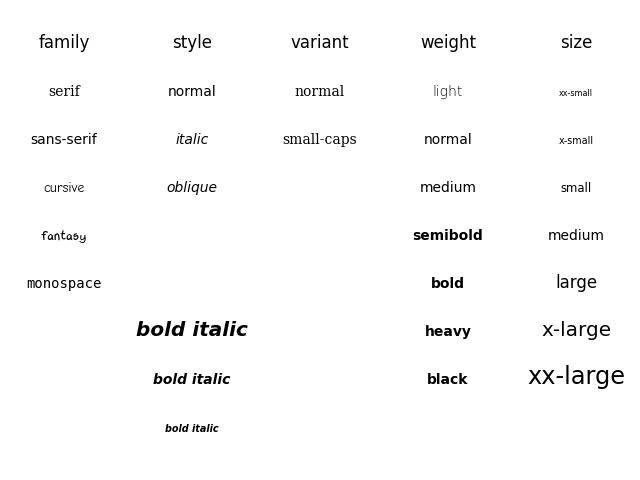
* family : 글씨체를 의미한다
* style : 진하게나 기울임을 사용해 강조할 때 사용한다
* weight : 글씨 두께를 설정하며 글씨체마다 상이하다
```python
fig, ax = plt.subplots()
ax.set_xlim(0, 1)
ax.set_ylim(0, 1)
ax.text(x=0.5, y=0.5, s='Text\nis Important',
# fontsize=20,
# fontweight='bold',
# fontfamily='serif',
)
plt.show()
```

여기서는 `fontsize=20` 로 했지만 `fontsize=large` 도 가능하다.
#### 2-2. Details
폰트 자체와는 조금 다르지만 커스텀할 수 있는 요소들입니다.
* `color : 글씨색`
* `linespacing : 줄간격`
* `backgroundcolor : 배경색`
* `alpha : 투명도`
* `zorder : z축으로의 순서 (ppt로 치면 맨 앞, 맨 뒤로 가져오기)`
* `visible : 보이게 할지 안보이게 할지 정하는 기능. 잘 사용하지는 않음`
```python
fig, ax = plt.subplots()
ax.set_xlim(0, 1)
ax.set_ylim(0, 1)
ax.text(x=0.5, y=0.5, s='Text\nis Important',
fontsize=20,
fontweight='bold',
fontfamily='serif',
# color='royalblue',
# linespacing=2,
# backgroundcolor='lightgray',
# alpha=0.5
)
plt.show()
```

#### 2-3. Alignment
정렬과 관련하여 이런 요소들을 조정할 수 있습니다.
* `ha` : horizontal alignment
* `va` : vertical alignment
* `rotation`
* `multialignment`
```python
fig, ax = plt.subplots()
ax.set_xlim(0, 1)
ax.set_ylim(0, 1)
ax.text(x=0.5, y=0.5, s='Text\nis Important',
fontsize=20,
fontweight='bold',
# fontfamily='serif',
color='royalblue',
linespacing=2,
va='center', # top, bottom, center
ha='center', # left, right, center
rotation='horizontal' # vertical?
)
plt.show()
```
또, rotation은 degree로도 입력이 가능하다
* `rotation=45`

#### 2-4. Advanced
* `bbox`
* [Drawing fancy boxes](https://matplotlib.org/stable/gallery/shapes_and_collections/fancybox_demo.html)
```python
fig, ax = plt.subplots()
ax.set_xlim(0, 1)
ax.set_ylim(0, 1)
ax.text(x=0.5, y=0.5, s='Text\nis Important',
fontsize=20,
fontweight='bold',
# fontfamily='serif',
color='black',
linespacing=2,
va='center', # top, bottom, center
ha='center', # left, right, center
rotation='horizontal', # vertical?
bbox=dict(boxstyle='round', facecolor='wheat', alpha=0.4)
)
plt.show()
```
* bbox는 또 다음과 같은 속성을 가진다
* `pad` : 패딩을 설정
* `ec` : 테두리 색을 설정

### 3. Text API 별 추가 사용법 with 실습
#### 3-0. 기본적인 플롯
```
student = pd.read_csv('./StudentsPerformance.csv')
student.head()
```
| | gender | race/ethnicity | parental level of education | lunch | test preparation course | math score | reading score | writing score |
| - | ------ | -------------- | --------------------------- | ------------ | ----------------------- | ---------- | ------------- | ------------- |
| 0 | female | group B | bachelor's degree | standard | none | 72 | 72 | 74 |
| 1 | female | group C | some college | standard | completed | 69 | 90 | 88 |
| 2 | female | group B | master's degree | standard | none | 90 | 95 | 93 |
| 3 | male | group A | associate's degree | free/reduced | none | 47 | 57 | 44 |
| 4 | male | group C | some college | standard | none | 76 | 78 | 75 |
```python
fig = plt.figure(figsize=(9, 9))
ax = fig.add_subplot(111, aspect=1)
for g, c in zip(['male', 'female'], ['royalblue', 'tomato']):
student_sub = student[student['gender']==g]
ax.scatter(x=student_sub ['math score'], y=student_sub ['reading score'],
c=c,
alpha=0.5,
label=g)
ax.set_xlim(-3, 102)
ax.set_ylim(-3, 102)
ax.spines['top'].set_visible(False)
ax.spines['right'].set_visible(False)
ax.set_xlabel('Math Score')
ax.set_ylabel('Reading Score')
ax.set_title('Score Relation')
ax.legend()
plt.show()
```

#### 3-1. Title & Legend
* 제목의 위치 조정하기
* 범례에 제목, 그림자 달기, 위치 조정하기
```python
fig = plt.figure(figsize=(9, 9))
ax = fig.add_subplot(111, aspect=1)
for g, c in zip(['male', 'female'], ['royalblue', 'tomato']):
student_sub = student[student['gender']==g]
ax.scatter(x=student_sub ['math score'], y=student_sub ['reading score'],
c=c,
alpha=0.5,
label=g)
ax.set_xlim(-3, 102)
ax.set_ylim(-3, 102)
ax.spines['top'].set_visible(False)
ax.spines['right'].set_visible(False)
ax.set_xlabel('Math Score',
fontweight='semibold')
ax.set_ylabel('Reading Score',
fontweight='semibold')
ax.set_title('Score Relation',
loc='left', va='bottom',
fontweight='bold', fontsize=15
)
ax.legend(
title='Gender',
shadow=True,
labelspacing=1.2,
# loc='lower right'
# bbox_to_anchor=[1.2, 0.5]
)
plt.show()
```
* `ax.set_title` 은 `loc` 로 왼쪽, 가운데 또는 오른쪽에 위치시킬 수 있다
* `ax_legend` 는 그래프의 빈공간에 자동으로 생성되지만 사용자가 `loc` 또는 `bbox_to_anchor` 를 사용해서 위치시킬 수 있다
* `bbox_to_anchor` 를 이용하면 ax 밖으로도 위치시킬 수 있다
* 0\~1을 넘은 값을 입력하면 밖으로 위치된다.
* `ncol` 을 이용하면 범주를 세로로 나열할지 가로로 나열하맂 정할 수 있다

* bbox\_to\_anchor을 더 이해하고 싶다면 [link](https://stackoverflow.com/questions/39803385/what-does-a-4-element-tuple-argument-for-bbox-to-anchor-mean-in-matplotlib/39806180#39806180) 참고
#### 3-2. Ticks & Text
* tick을 없애거나 조정하는 방법
* text의 alignment가 필요한 이유
```python
def score_band(x):
tmp = (x+9)//10
if tmp <= 1:
return '0 - 10'
return f'{tmp*10-9} - {tmp*10}'
student['math-range'] = student['math score'].apply(score_band)
student['math-range'].value_counts().sort_index()
```
```
0 - 10 2
11 - 20 2
21 - 30 12
31 - 40 34
41 - 50 100
51 - 60 189
61 - 70 270
71 - 80 215
81 - 90 126
91 - 100 50
Name: math-range, dtype: int64
```
```python
math_grade = student['math-range'].value_counts().sort_index()
fig, ax = plt.subplots(1, 1, figsize=(11, 7))
ax.bar(math_grade.index, math_grade,
width=0.65,
color='royalblue',
linewidth=1,
edgecolor='black'
)
ax.margins(0.07)
plt.show()
```

현재는 각 막대의 수치를 잘 알수 없다는 단점이 있다. 이럴 경우 grid를 추가해주는 것도 하나의 방법이지만 막대그래프 위에 수치를 표현해주는 것이 제일 좋다. 만약 수치를 표현해준다면 y축이 딱히 필요가 없으니 이를 제거한다.
```python
math_grade = student['math-range'].value_counts().sort_index()
fig, ax = plt.subplots(1, 1, figsize=(11, 7))
ax.bar(math_grade.index, math_grade,
width=0.65,
color='royalblue',
linewidth=1,
edgecolor='black'
)
ax.margins(0.01, 0.1)
ax.set(frame_on=False)
ax.set_yticks([])
ax.set_xticks(np.arange(len(math_grade)))
ax.set_xticklabels(math_grade.index)
ax.set_title('Math Score Distribution', fontsize=14, fontweight='semibold')
for idx, val in math_grade.iteritems():
ax.text(x=idx, y=val+3, s=val,
va='bottom', ha='center',
fontsize=11, fontweight='semibold'
)
plt.show()
```

* `ax.set(frame_on=False)` 를 설정하면 4개의 테두리가 지워진다.
* `ax.set_yticks([])` 로 설정하면 y축이 지워진다.
#### 3-3. Annotate
* 화살표 사용하기
```python
fig = plt.figure(figsize=(9, 9))
ax = fig.add_subplot(111, aspect=1)
i = 13
ax.scatter(x=student['math score'], y=student['reading score'],
c='lightgray',
alpha=0.9, zorder=5)
ax.scatter(x=student['math score'][i], y=student['reading score'][i],
c='tomato',
alpha=1, zorder=10)
ax.set_xlim(-3, 102)
ax.set_ylim(-3, 102)
ax.spines['top'].set_visible(False)
ax.spines['right'].set_visible(False)
ax.set_xlabel('Math Score')
ax.set_ylabel('Reading Score')
ax.set_title('Score Relation')
# x축과 평행한 선
ax.plot([-3, student['math score'][i]], [student['reading score'][i]]*2,
color='gray', linestyle='--',
zorder=8)
# y축과 평행한 선
ax.plot([student['math score'][i]]*2, [-3, student['reading score'][i]],
color='gray', linestyle='--',
zorder=8)
bbox = dict(boxstyle="round", fc='wheat', pad=0.2)
arrowprops = dict(
arrowstyle="->")
ax.annotate(text=f'This is #{i} Studnet',
xy=(student['math score'][i], student['reading score'][i]),
xytext=[80, 40],
bbox=bbox,
arrowprops=arrowprops,
zorder=9
)
plt.show()
```

---
# Agent Instructions: Querying This Documentation
If you need additional information that is not directly available in this page, you can query the documentation dynamically by asking a question.
Perform an HTTP GET request on the current page URL with the `ask` query parameter:
```
GET https://sangmandu.gitbook.io/til/til_ml/boostcamp-2st/s-data-viz/3-1-text.md?ask=
```
The question should be specific, self-contained, and written in natural language.
The response will contain a direct answer to the question and relevant excerpts and sources from the documentation.
Use this mechanism when the answer is not explicitly present in the current page, you need clarification or additional context, or you want to retrieve related documentation sections.